FlexQoS UI Bandwidth Settings tables
- Thread starter dave14305
- Start date

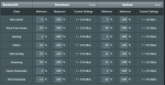
") ). It's easier to associate the settings to the list and pie-chart from my point of view.
). It's easier to associate the settings to the list and pie-chart from my point of view.

Similar threads
Similar threads
Similar threads
-
-
-
FTDI Serial Port Settings Using Virtual Here Server on Asus Merlin
- Started by supwiddiss
- Replies: 0
-
-
-
Latest threads
-
Any router with VPN Split Tunneling for Website Unblocking (Selective VPN)?
- Started by ebr4him
- Replies: 0
-
iOS devices stop responding to network for up to 30 seconds
- Started by Iamslick
- Replies: 1
-
 Advise for new purchase of newer model ASUS router that gets Merlin Firmware for 3 bedroom appartment?
- Started by PCDOK2R3N
- Replies: 6
-

-
 YazFi Using 2 Guest Networks with Yazfi and Disabling Intranet for Access Points
- Started by poolbeetse7en
- Replies: 4
Support SNBForums w/ Amazon
If you'd like to support SNBForums, just use this link and buy anything on Amazon. Thanks!
Sign Up For SNBForums Daily Digest
Get an update of what's new every day delivered to your mailbox. Sign up here!